|
10/29/2017 0 Comments Ambient intelligenceIn computing, ambient intelligence (AmI) refers to electronic environments that are sensitive and responsive to the presence of people. Ambient intelligence is a vision on the future of consumer electronics, telecommunicationsand computing that was originally developed in the late 1990s by Eli Zelkha and his team at Palo Alto Ventures for the time frame 2010–2020. In an ambient intelligence world, devices work in concert to support people in carrying out their everyday life activities, tasks and rituals in an easy, natural way using information and intelligence that is hidden in the network connecting these devices ( Internet of Things). As these devices grow smaller, more connected and more integrated into our environment, the technology disappears into our surroundings until only the user interface remains perceivable by users. The ambient intelligence paradigm builds upon pervasive computing, ubiquitous computing, profiling, context awareness, and human-centric computer interaction design and is characterized by systems and technologies that are (Zelkha et al. 1998; Aarts, Harwig & Schuurmans 2001): • embedded: many networked devices are integrated into the environment • context aware: these devices can recognize you and your situational context • personalized: they can be tailored to your needs • adaptive: they can change in response to you • anticipatory: they can anticipate your desires without conscious mediation. A typical context of ambient intelligence environment is a Home environment (Bieliková & Krajcovic 2001). 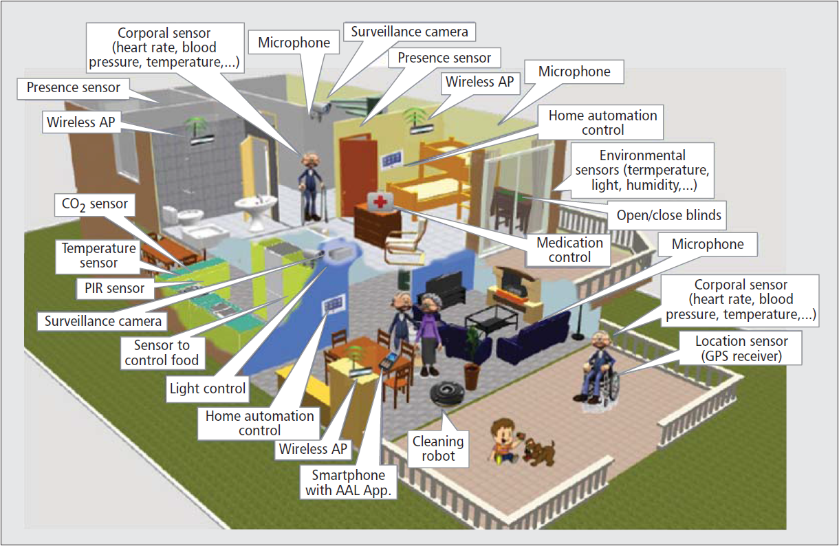
0 Comments
A programming language is a formal language that specifies a set of instructions that can be used to produce various kinds of output. Programming languages generally consist of instructions for a computer. Programming languages can be used to create programs that implement specific algorithms. Programmers have always known that new programming languages need to be learned to keep their skills marketable in the workplace. That trend is not only continuing – it seems to be increasing due to the rate of change taking place in the technology sector. Programming languages like C, C++, Java, HTML, Python, or PHP have always had answers to the demands of the market. However, progression in the innovation sector requires people to gain even more skills and knowledge to bring ideas to life. 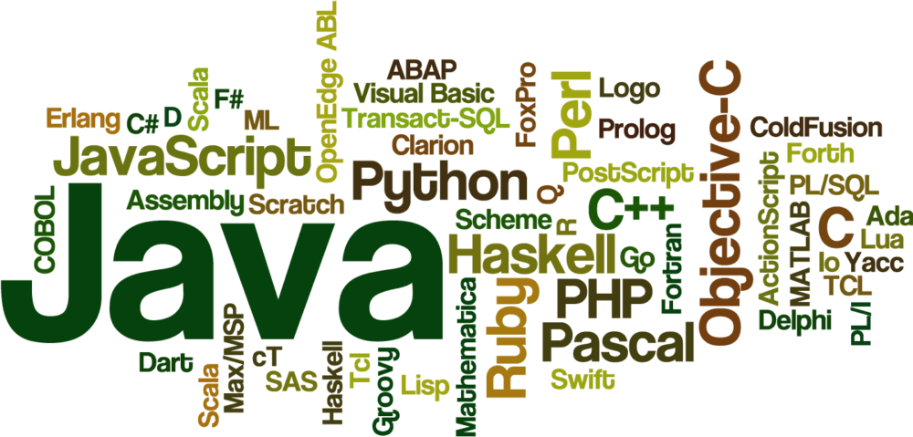 Google Go Google’s Go Programming Language was created in 2009 by three Google employees, Robert Griesemer, Rob Pike, and Ken Thompson. The language’s success can be seen clearly by the fact that BBC, SoundCloud, Facebook and UK Government’s official website are some of the notable users of Go. It is faster, easier to learn and does the same job that C++ or Java has been doing for us. As the creators said, “Go is an attempt to combine the ease of programming of an interpreted, dynamically typed language with the efficiency and safety of a statically typed, compiled language. Hack Hack is another programming language which has recently been launched and is a product of another tech giant, Facebook. In the past one year, Facebook has transformed almost their entire PHP codebase to Hack, and if a website with millions of users and unparalleled traffic can rely on Hack, then the programming language must surely be here to stay. Read More 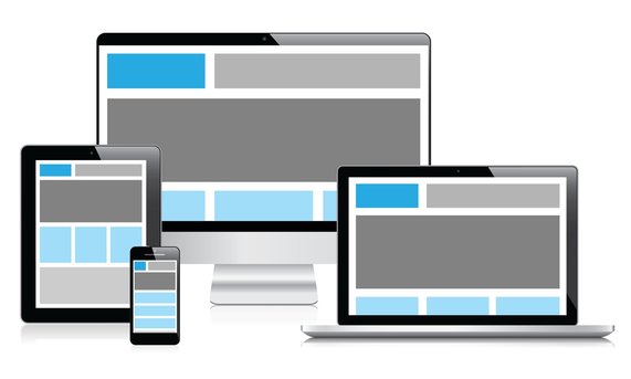 Responsive web design aimed at allowing desktop webpages to be viewed in response to the size of the screen or web browser one is viewing with. offering the same support to a variety of devices for a single website, content, design and performance are necessary across all devices to ensure usability and satisfaction Meaning: build a website that support (mobiles, tablets, ipads, laptops and pcs) To start developing responsive websites you need to know three things:
Fluid and flexible layouts: Fluid layout uses relative units instead of fixed units. Typically a fluid layout will use percentages instead of pixels, but any relative unit of measurement will work Static: A static page layout (sometimes called a “fixed” layout or “fixed width” layout) uses a preset page size and does not change based on the browser width. In other words, the page layout might have a permanent width of 960 pixels no matter what. This is how web pages were traditionally built for many years until modern influences like media queries and responsive design were introduced around the start of the 2010s. Example: section{width:960px} Fluid: Fluid layout often will fill the width of the page, no matter what the width of the browser might be. use precentages insted of fixed widths Example: section{width:60%} Flexible images Flexible images are also sized in relative units, so as to prevent them from displaying outside their containing element. example: To create scalable images, simply add the following code to your stylesheet: img { max-width: 100%; } or img { min-width: 100%; } Css3 media queries Css3 media queries allowes the content rendering to adapt to conditions such as screen resolution (e.g. smartphone screen, tablet screen and computer screen) max-width : deffine the maximum width of the screen that will apply the media query @media only screen and (max-width: 1024px) { /* For small laptops screen and ipads: */ } @media only screen and (max-width: 768px) { /* For tablets and small ipads : */ } @media only screen and (max-width: 480px) { /* For mobile: */ } min-width : deffine the minimum width of the screen that will apply the media query @media only screen and (min-width: 1024px) { } @media only screen and (min-width: 768px) { } @media only screen and (min-width: 480px) { } @media only screen and (min-width: 320px) { } min and max width : deffine the minimum width and the maximum of the screen that will apply the media query @media screen and (min-width: 321px) and (max-width: 767px) { } Orientation: Portrait / Landscape Media queries can also be used to change layout of a page depending on the orientation of the browser. You can have a set of CSS properties that will only apply when the browser window is wider than its height, a so called "Landscape" orientation: @media only screen and (orientation: landscape) { body { background-color: lightblue; } } Example: Header nav Note: resize your browser to see header { background-color: #245690; text-align: center; color: #ffffff; padding: 1%; margin-bottom: 1%; } .nav { background-color: #245690; color: #ffffff; float: left; text-align: center; width: 35%; padding-top: 10%; padding-bottom: 10%; margin-right: 5%; } .section { background-color: #245690; color: #ffffff; float: left; text-align: center; width: 60%; padding-top: 1%; padding-bottom: 1%; } .section img { max-width: 100%; } @media only screen and (max-width: 1024px) { /* For small laptops screen and ipads: */ .nav { width: 45%; padding-top: 20%; padding-bottom: 20%; } .section { width: 50%; } } @media only screen and (max-width: 768px) { /* For tablets and small ipads : */ header { padding-top: 3%; padding-bottom: 3%; } .nav { width: 80%; margin-left: 10%; margin-right: 10%; padding-top: 20%; padding-bottom: 20%; margin-bottom: 1%; float: none; } .section { width: 80%; margin-left: 10%; margin-right: 10%; float: none; } } @media only screen and (max-width: 480px) { /* For mobile: */ .nav { width: 100%; margin-left: 0%; margin-right: 0%; } .section { width: 100%; margin-left: 0%; margin-right: 0%; } } Read More & Examples |
 RSS Feed
